Tuesday, January 31, 2012

Assignment


I chose this 70's style pattern to compare to mine.  Almost everything about it, except the colors, look very similar to my thumbnail inspired by a peacock.  The reason it mainly looks like mine is because the inner circles radiating and the vertical lines. All it needs is some blues, violets, and more green!

Above is also a retro vibe.  This also is connected to my peacock inspired drawing. Not only is there an actual bird in the photo, but the bright colors and waviness of the lines also reflect mine. 

Monday, January 23, 2012

46) Illusion of Motion by Multiple Image


This is an example of illusion of motion by multiple image.  The woman is twirling in a circle, creating the motion, while the individual frames connect each part of the twirl.  Also when can see movement in the woman's hair and dress. 

45) Illusion of Motion by Blurred Outline


In this piece of art, the illusion of motion is represented by the blurred outlines of the falling rain.  When it rains, we don't see each individual raindrop, we see an illusion of streaks because the rain is falling so quickly, this artwork blurs the rain creating motion.  

44) Illusion of Motion by Repeated Figure


In this famous painting by Edgar Degas, the use of repeated figures create an illusion of motion.  The use of three different dancers dancing, creates that illusion.  The dancer could be represented as one dancer doing three different dance moves.  

43) Anticipated Motion


This photo of a dog, is an obvious example of anticipated motion.  We as humans know what a dog looks like when it is jumping, and that is what this photo shows.  The fur is blurred from movement as well. 

42) Spatial Puzzle (Equivocal Space)


In this Picasso painting, equivocal space is represented.  This is because shapes in the painting are transparent creating no depth perception, which virtually leads mind-boggling image.  

41) Multiple Perspective


This is an example of multiple perspective in a photograph.  Instead of the dock being a straight, linear stretch, it is curved; giving multiple perspectives. If you were to stand at any point of the dock, your perspective would change since it's not straight.  

40) Amplified Perspective


Amplified Perspective takes the illusion on space and depth to a whole different level.  In this photograph of a frog, the focus is purely on the face, amplifying it's size compared to it's blurred body.  By using macro photography and amplified perspective, the face of the frog looks like a giant.  

39) Illusion of Space by Linear Perspective


This photo is an example of illusion of space by linear perspective.  This photo has a vanishing point (where all parallel lines meet.)  Even the sides and top lines of the buildings are converging into the vanishing point parallel to the end of the road.  

38) Illusion of Space by Aerial Perspective


Illusion of space by aerial perspective is represented by object closer to the audience have a more distinct contrast while those farther away diminish into the background and have less contrast.  The animals farther away are blending in more with the surrounding colors, also the leave and branches closer to us are darker, sharper and more contrasted.  

37) Illusion of Space by Vertical Location


In this black and white photo of trees, the use of angled photography gives the illusion of space on a two- dimensional photo.  Because the photographer took the picture from a low perspective it shows how tall the trees really are vertically, creating space while the branches at the top get smaller and smaller.  

36) Illusion of Space by Overlapping


In this painting, the overlapping house and trees make an illusion of space by overlapping.  Also, the light and small tree infront of the house create an illusion of depth which creates an illusion of space.  When objects are overlapping, those larger come out closer in the painting. 

35) Scale Confusion


In this painting by Picasso, the proportion and scale of the woman are not average; giving scale confusion.  An average woman wouldn't have those unusual proportions.  

34) Alternating Rhythm


In this photo of a flower, each pedal has an alternating color, creating an alternating rhythm.  Each pedal is identical in size, while every other pedal is colored either yellow or violet.  

33) Progressive Rhythm


In this photograph, the wood in the water and their reflections are creating a progressive rhythm within the photo.  There are unequal spaces between each reflection, giving a progressive space within the photograph. 

32) Absence of Focal Point


In this painting by Jackson Pollock, there is no focal point.  The "paint splatter" or "paint drip" method creates a random pattern of color, lines, and shapes; therefor, and absence of any focal point.  

31) Degree of Emphasis


In this painting by Matisse, there is a primary, secondary and tertiary focal point.  

Primary Focal Point-- The red turtle at the bottom of the painting because the color, size, and placement.

Secondary Focal Point- the person on the left side of the painting because her/his hand is connected directly to the primary focal point.

Tertiary Focal Point- the person in the middle because of it's distance from the secondary focal point.  

30) Emphasis by Placement


In this painting, the girl in the field is emphasized by the placement the artist chose.  The girl is at our eye level, which also creates more emphasis, also the fact that there is nothing distracting around the girl creates emphasis.  

29) Emphasis by Isolation


In this photograph, the flowers are isolated from all visible objects, creating an emphasis upon the plant.  Also, the use of blurring the far background creates an even more focused isolation.  

28) Emphasis by Contrast


In this painting, the little girls red skirt is emphasized through the use of contrasted color.  The surroundings of the little girl are mostly dark greens and browns, then POW a bright, red skirt right in the middle of the frame creates a huge color contrasted emphasis.  

27) Crystallographic Balance


This is a painting, believe it or not, and it is a great example of crystallographic balance (all over pattern).  Each crossing of vertical and horizontal line creates a small square.  So, the repetition of crossing lines creates an all over pattern.  

26) Radial Balance


Above is an example of radial balance.  The center of the painting, the flower bulb, is the point of radiation for the pedals' vein-like stripes and equally balanced leaves.  

25) Asymmetrical Balance


This painting by Monet is asymmetrical.  Unlike a symmetrical painting, this painting has more visual weight on the left side than the right.  The dark buildings on the left side look "heavier" then the blurred colors on the right side.

24) Symmetrical Balance


This drawing by Leonardo da Vinci, is an example of symmetrical balance.  The drawing is directly centered on the paper and the crack down the skull also creates the dividing line of symmetrical balance.  Both sides of the drawing are equally balanced.  

23) Unity with Variety


In the art Marilyn Monroe by Andy Warhol, the faces show unity with variety.  Because compositionally speaking, each face is the same, the color change creates the variety.  Each face is colored differently which not only makes the art compelling, but variations within an overall unity.  

22) Unity through Continuity


Unity through continuity is the use of implies or actual lines that give a flow to the art work.  In this painting by Tintoretto titled Ariadne Venus and Bacchus the arms of the three people are all pointing to the focal point of the painting.  The arms give implied lines of connecting to each other to give unity and flow to the eye.  

21) Unity through Continuation


This photograph of a railroad, that I took myself, shows unity through continuation.  People automatically know by looking at the photo, that the railroad will continue going straight until it reaches its destination.  Each line will go directly into the vanishing point, also giving unity.  

20) Unity through Repetition


In Barbara Takenaga's "Angel (Little Egypt) State 1, unity is represented with repetition. There is a pattern with black, teal, and white circles inclosed with a fin-shaped area.  The pattern gradually gets smaller towards the focal point in the middle of the artwork.  The overall repetition of the pattern ties in the unity of the overall look and feel of the piece. 

19) Unity through Proximity


Unity through proximity is the visual distance between the elements in an artwork.  In this painting by Leonardo da Vinci, Leda, the main woman in the painting, has very close visual connection to each child.  The closer the elements are, the more unity there is.  In this particular piece, all objects are fairly close to each other, practically touching, creating a high unity with proximity. 

18) Visual Texture


The drawing of the feline above, gives us a great amount texture on a flat surface.  By using colored pencils and shading techniques, the artist gives a feel for visual texture.  Visual texture is difficult is draw on a flat sheet of paper, but by using certain techniques, it can be achieved!

17) Tactile Texture


Tactile texture is a 3D representation of a texture; like fur or wool.  The drawing of the peanut is NOT a correct example of tactile texture because it is a 2D drawing.  If we were looking at a real peanut, it would be an example of tactile texture.  

16) Value as Emphasis


 Girl with a Pearl Earring by Jan Vermeer is a painting of a young girl before her wedding.  Because there is no background, just a black background, there is empahasis on the young girl.  The black is valued so dark that it automatically makes the positive space pop at your.  Also, the use of valued shadows bring attention to the focal point of the piece, the pearl earring.   

15) Value as Pattern


In this pen and ink drawing by Tony Hong, the tree rings have a pattern with different values.  Values in drawings can be done by the darkness of the medium used.  each ring has a different pattern while they still gradually get smaller into the center of the tree.  The values are gradually altered in each ring to give depth and pattern.  

14) Curvilinear Shapes


One of my personal favorites, The Great Wave of Kanagawa by Hokusai, is composed mostly of curvilinear shapes.  The edges of the waves and the background all have rounded edges and soft curves.  There is the occasional straight edge line from the boats to balance everything out, but the painting is dominated by curved lines, proving it is curvilinear.  

13) Rectilinear Shapes


Country Village by Jean Metzinger is an example of rectilinear shapes. The straight lines in the art work and few curved angular corners is what makes this piece a great example for rectilinear shapes.  The use of dark and sharp edges give it the drama and intensity for a great piece of artwork. 

12) Nonobjective Shapes


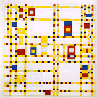
Broadway Boogie Woogie by Piet Mondrian in composed entirely of non objective shapes.  All of the different colored squares and rectangles are non objective in that they aren't representing anything but simple shapes.  

11) Abstraction


This painting by Salvador Dali, the elephant leg's are abstracted.  When artwork is considered abstract, it basically means the art is tweaked to look a bit of out reality but still being recognizable.  Because in real life no such animal has legs 100's of feet long means they are abstracted.  

10) Idealism


Statues are a great example of idealism.  Statues have flawless skin and perfect proportions.  Idealism is kind of like a perfect version of something; in this case, it's the perfect version of a human.  Flawless.  

9) Distortion


Portrait of Dora Maar by Pablo Picasso is an example of distortion.  When something is distorted, it is altered in some way from reality.  In this case, the portrait shows the woman with yellow skin, both eyes are on one side of her face, and both nostrils are also on the same side of the face.

8) Naturalism


This oil painting by Jonathan Wateridge is part of a seven part oil painting series.  The fact that Jonathan can portray three dimensions and a sense of actually being at the scene to the painting is a success. The painting is done so well, it looks like we are looking at an actual plane, representing naturalism.  The fact that the painting looks like a real photograph also gives a sense of naturalism.   

7) Lost and Found Contour


In this painting of a pear, lost and found contour lines are shown.  On the left side of the painting, the lines are heavy and contrasting the background.  On the right side of the painting, the heavy shadow of the pear fades into the background, giving a sense of lost contour lines.  

6) Line as Value


In this drawing, Drawing Hands by M.C. Escher, all of the lines are given different values.  By pressing harder with a soft lead pencil, you can create darker valued lines.  other techniques to create value with pencils, is by hatching or cross-hatching.  In Drawing Hands, Escher used a variety of values to create depth and perception with shadows and details.  

5) Gesture Line


Gesture lines are used to get a quick, simple sketch of the action portrayed by the subject without ever single detail.  Gesture lines, in the sketch above, are used to get an assumption of the actions by the people.  These lines are critical in having a finished product with the correct perspective in the action taking place.  It makes the human eye focus on what the subject is doing. 

4) Contour Line


The drawing above is a prime example of contour lines.  Contour lines give the illusion of space on a two-dimensional piece of paper.  When someone draws a contour drawing, there are no major details just the important outline of a drawing; no shading.  It would be like drawing an apple, without ever lifting your pencil. 

3) Line as Emotion


This self portrait by Vincent van Gogh has many lines intertwined within the painting.  The direction of the lines in the background make a spiral shape.  The background waves from the blue brush strokes provokes a calm and somewhat depressing emotion and mood.  Also, the sharp lines of his eyes and eyebrows give off as an emotion from facial expressions.  

2) Line Direction


This piece of artwork by Jusepe de Ribera, titled Seven Line Studies and Six Finished Studies of Eyes, is an example of line direction.  People always look into someones eyes and know which way they are looking by simply following their eye movement.  The implied line between the pupil of the eye and what it is looking at also implies the direction they are looking.  Also the line direction of the eyebrows express emotions of the person. 

1) Line as Shape


The work of Leonardo da Vinci, in my opinion, seem to have many lines with hatching and cross-hatching.  The above work of his titled Study for The Head of Leda shows many lines outlining the major shapes.  The hair and and facial features are outlined by lines to form overall shapes.  

Test